NoBull Veggieburger
Crafting Packaging that Evokes 100% Plants, 0% Bull
NoBull Burger stands as an emblem of genuine plant-based nourishment. Carving its niche in the veggie burger world, it was born from the culinary prowess of Crissanne Raymond, a chef and mother. The simple aspiration? Feed her family wholesome food. This passion saw her being fondly dubbed "the veggieburger lady", and with the earnest support of her daughters, NoBull Burger set up shop in Charlottesville, VA, in 2011.
The brand's ethos? Simple. 100% Plants. 0% Bull. An unwavering commitment to authentic, whole-food ingredients, devoid of lab-crafted imitations. As the brand matured, so grew the necessity for a design evolution – a task Buttermilk Creative was thrilled to helm.
Collaboration and Outcome:
With NoBull's team partnering every step, from ideation to finalization, we gained invaluable insights. Their hands-on approach and feedback from brand enthusiasts were pivotal. Additionally, a comprehensive survey involving customers and grocery buyers played a decisive role in our design journey.
The result?
This redesign heralded NoBull’s triumphant entry into Whole Food Market on a national scale, exposing the brand to an expansive audience. With its continuously expanding retail presence, NoBull stands as a testament to authentic plant-based delight.
Design Objectives:
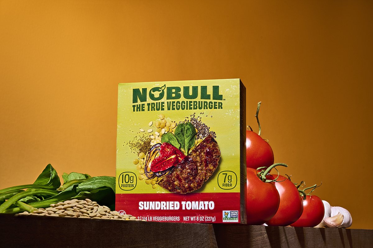
Our primary mission: encapsulate the transparent, high-quality essence of NoBull products. We strived for clarity, emphasizing that these weren't just any plant-based burgers. There was no synthesized chemicals hiding behind the label, just unadulterated whole foods. With a market brimming with competition and the inherent challenges of the freezer aisle (from foggy doors to product visibility), we needed a design that was both assertive and authentic.
Facing Challenges Head-On:
The contemporary plant-based food realm isn't without its sceptics. A surge of negative press and cultural headwinds challenged the perception of "plant-based". Our design needed to resonate with the brand's bold tagline, a testament to genuine, plant-based nutrition: “100% plants, 0% bull.”
Finding Inspiration:
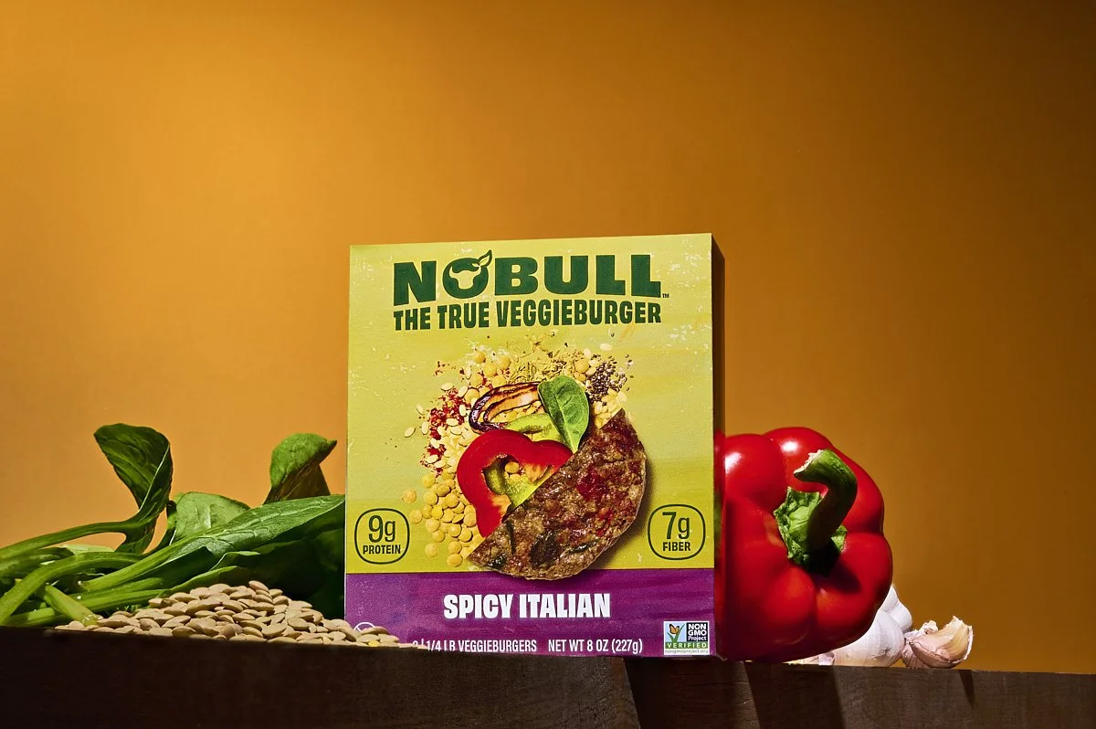
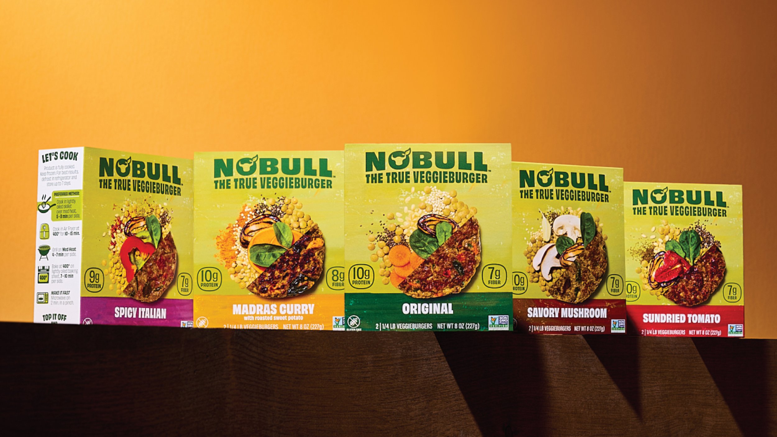
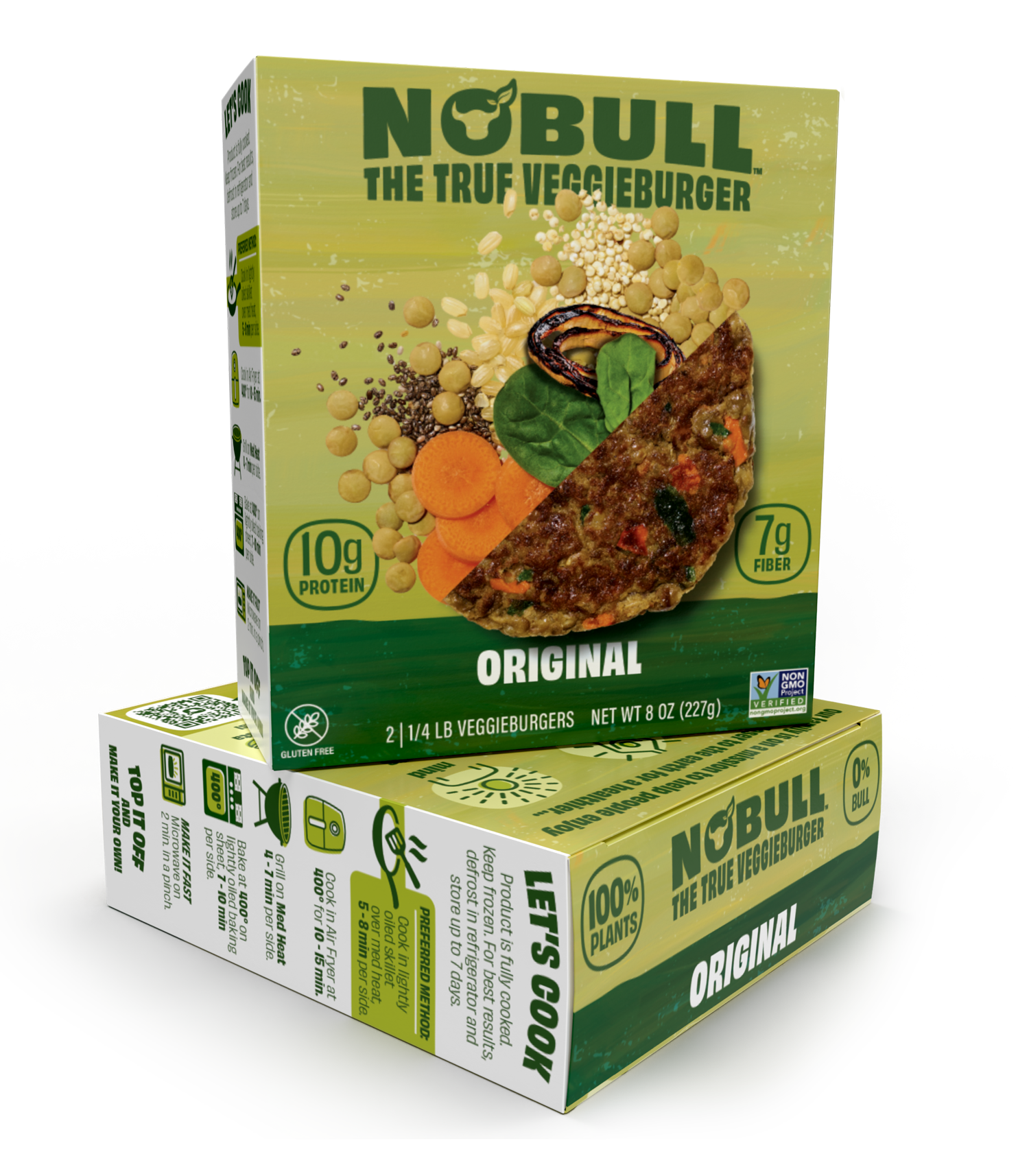
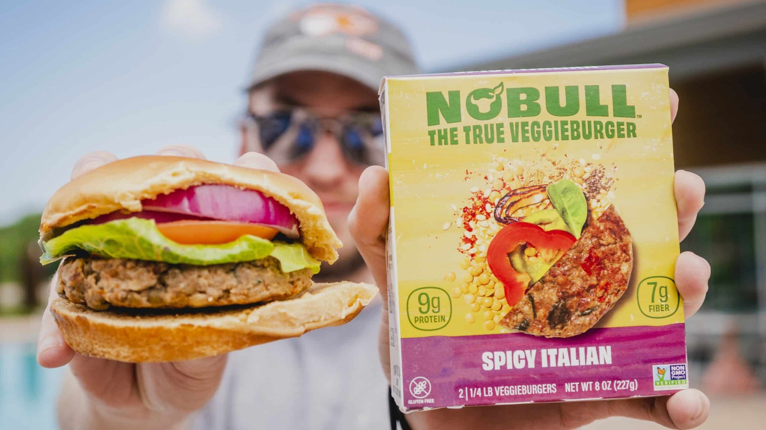
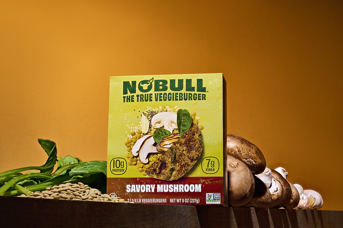
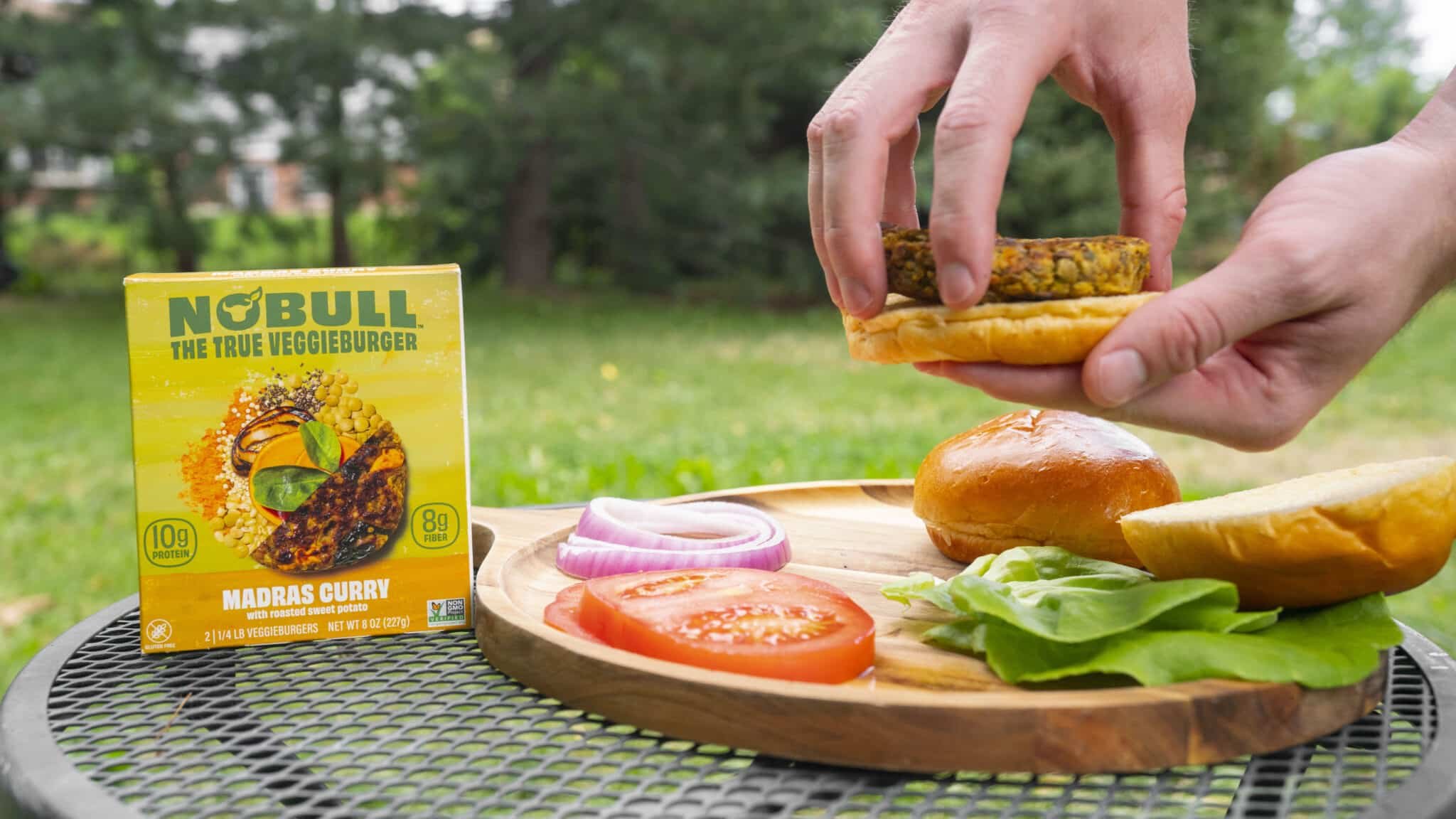
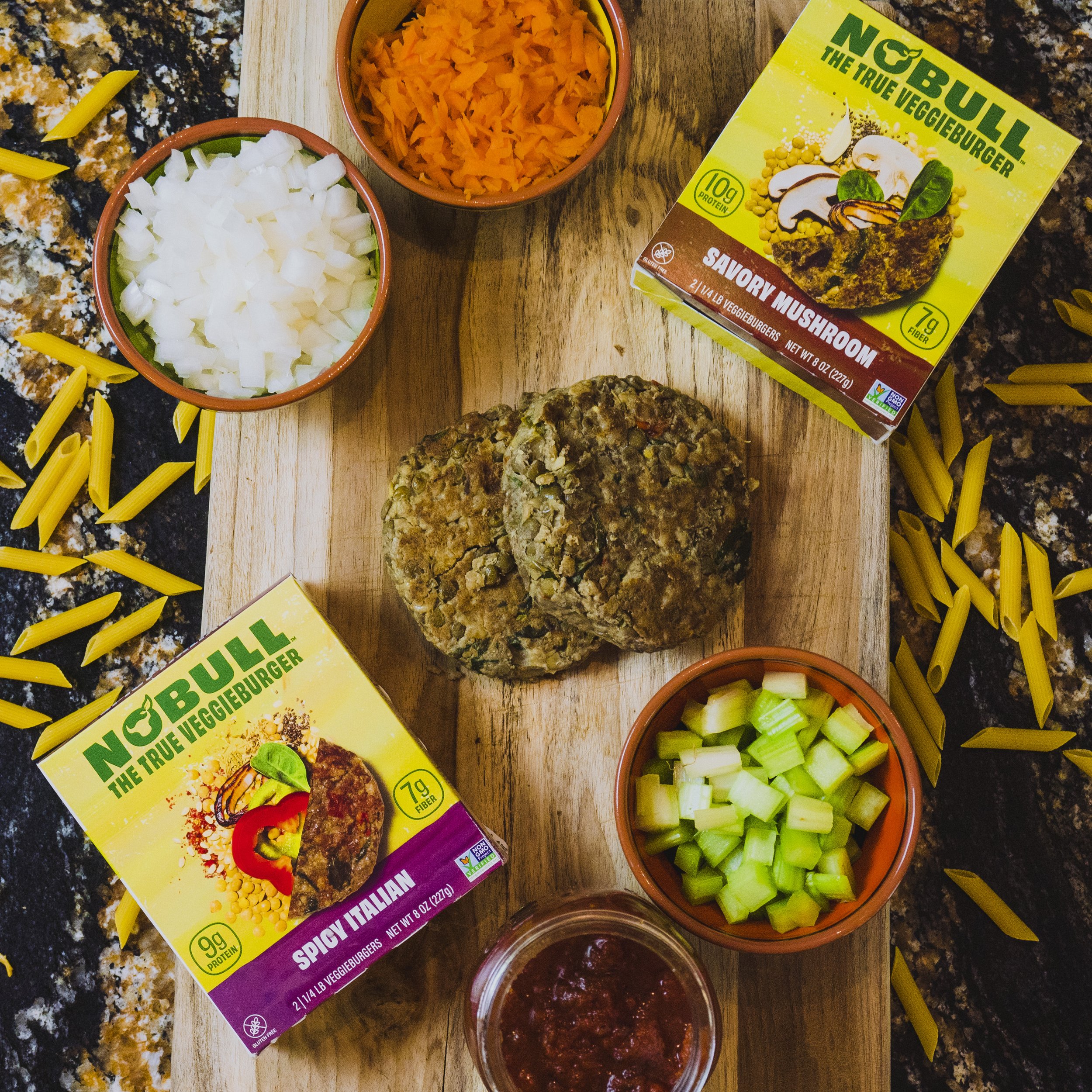
While competitors showcased their burgers typically nestled in a bun, we dared to be different. Inspired by the gap in representation, we opted to flaunt NoBull's key asset: its wholesome ingredients. The design embodied this, splitting the visuals between a delectable patty and the raw, natural ingredients that constitute it.
Logo Evolution:
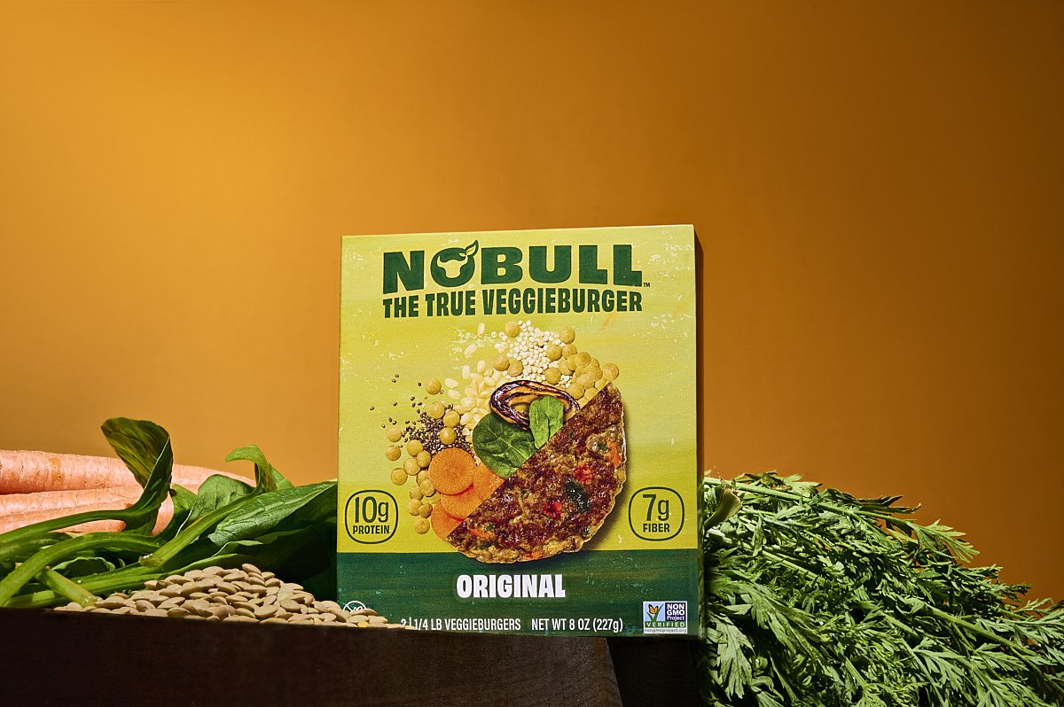
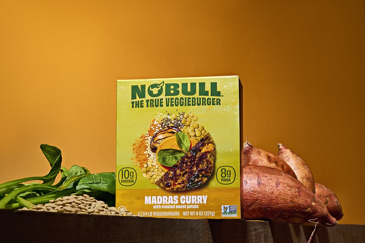
Preserving the legacy, yet driving innovation, was paramount in the logo redesign. The bull symbol, adorned with leafy horns, remained integral, but underwent a cleaner transformation. The typography was thickened, emboldening the brand's identity, serving as a robust anchor in all communication.
Packaging Dynamics:
Consistency was key. The vibrant "NoBull" green emerged as the dominant backdrop, complemented by flavor-specific color bands. While this facilitated ease of flavor navigation for consumers, it also ensured brand familiarity wasn't lost, especially for loyalists. The packaging design's pièce de résistance? A tantalizing visual collage: half showcasing a sumptuous patty and the other, its raw ingredients, almost spilling out in their natural glory.