Blue Zones Kitchen
Crafting Packaging that Celebrates Longevity and Flavor

At Buttermilk Creative, we’ve always had an appetite for the unique, the transformative, and the delicious. So, when Blue Zones Kitchen approached us with their new line of mouth-watering, ready-to-heat meals inspired by the world’s blue zones, we knew we were in for a culinary design adventure.
First, a little flavor text:
The blue zones are the world’s pockets of longevity. These regions have a mind-boggling number of centenarians—people who not just live to 100, but thrive, remaining sharp both in mind and body. It all started with Dan Buettner, a longevity aficionado and best-selling author, who undertook the epic quest of uncovering the secrets of these zones. Through his books and research, he introduced us to regions where plant-based diets, natural movement, strong relationships, and a profound sense of purpose seem to brew the perfect elixir of life.

And a Dash of Fun:
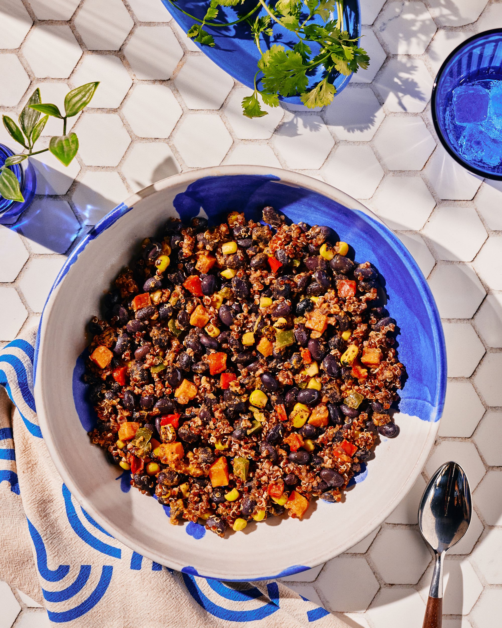
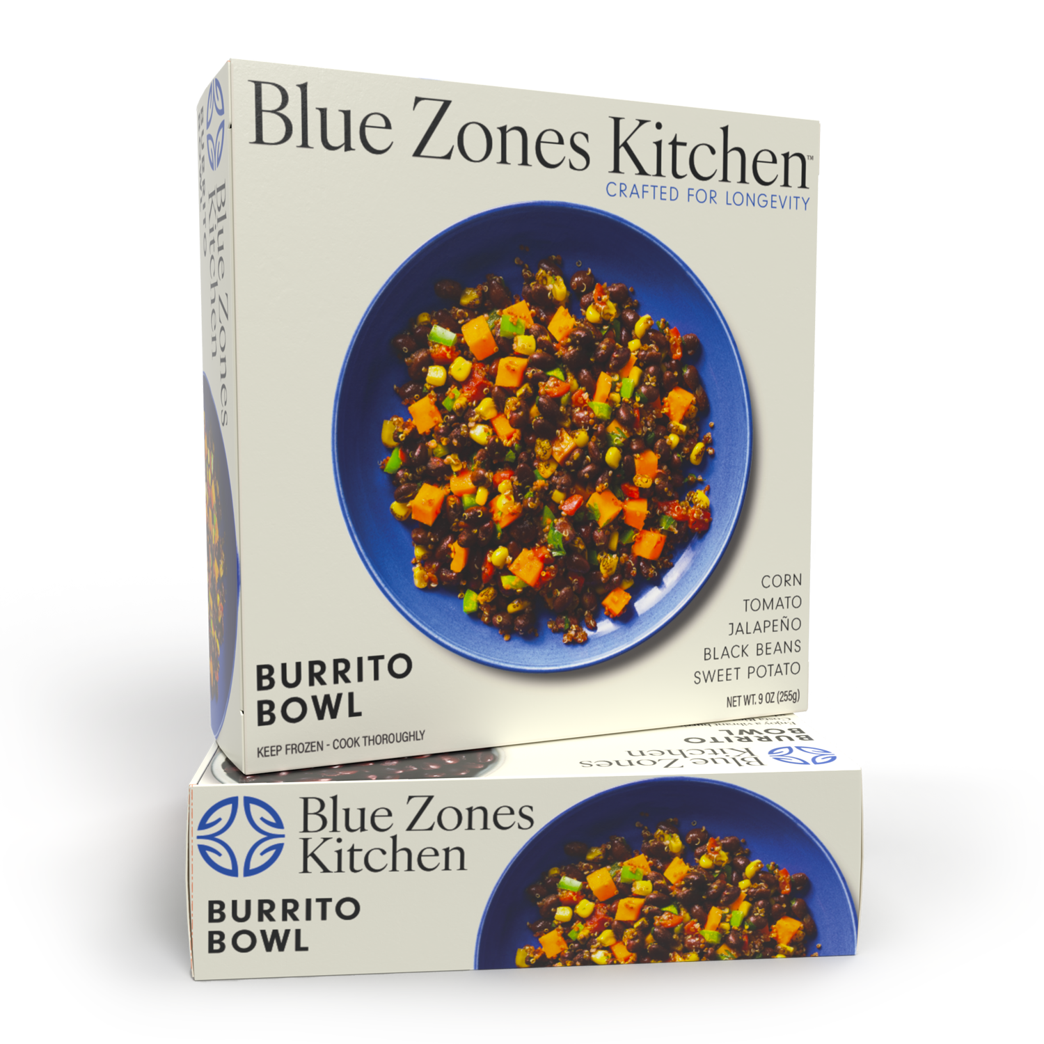
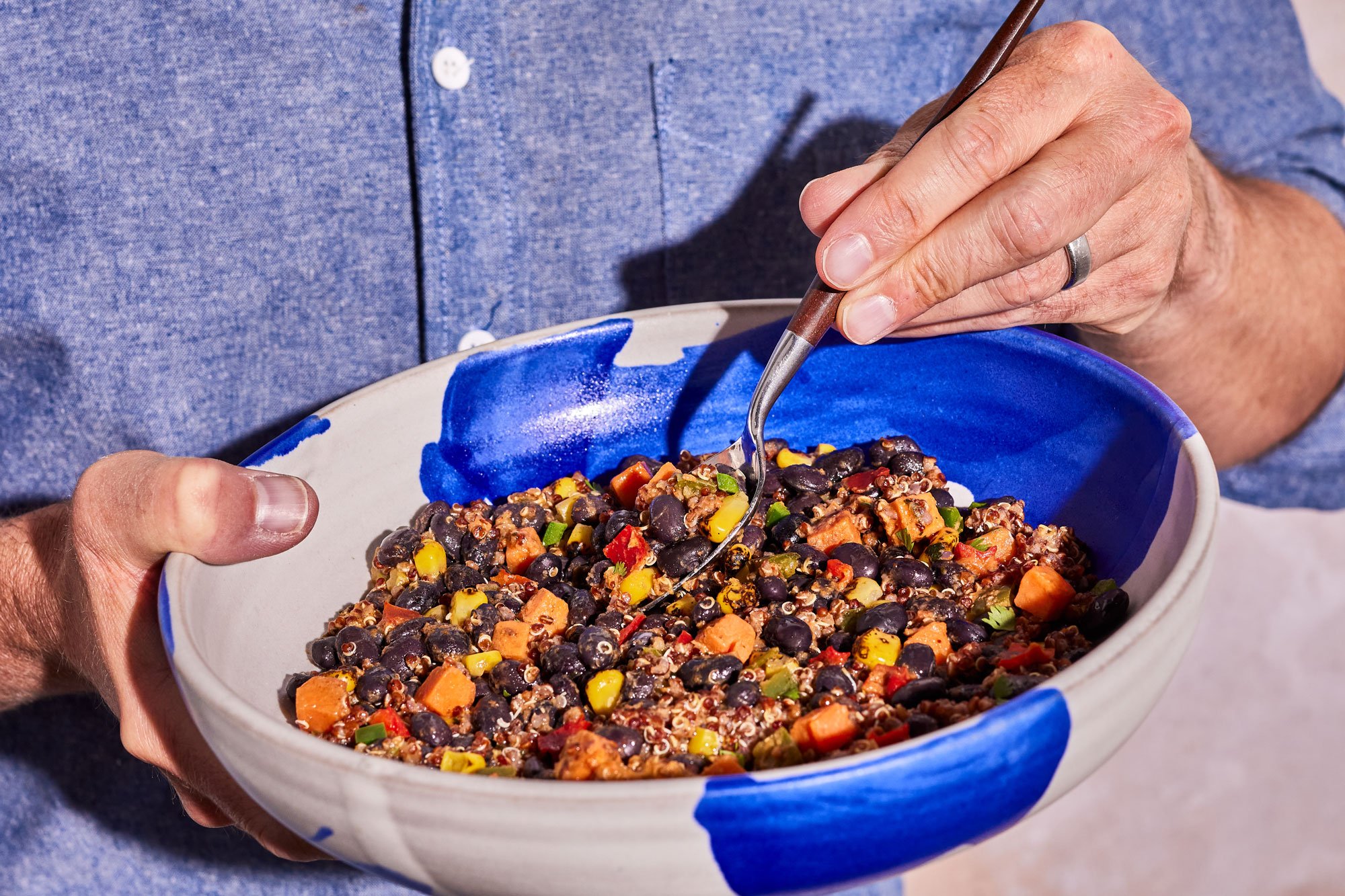
In the spirit of collaboration, we teamed up with renowned food photographer, Dhanraj Emanuel. But the cherry on top—or rather, the plate beneath? The iconic blue plate that cradles each meal, a masterpiece crafted by a talented North Carolina pottery artist, adding a touch of local artistry to every bite.
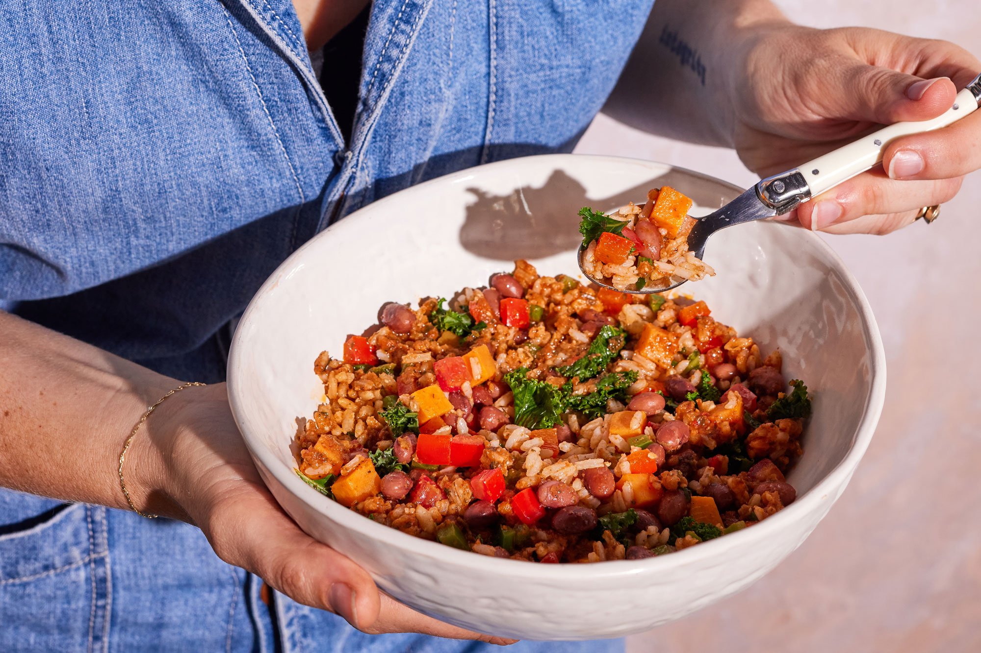
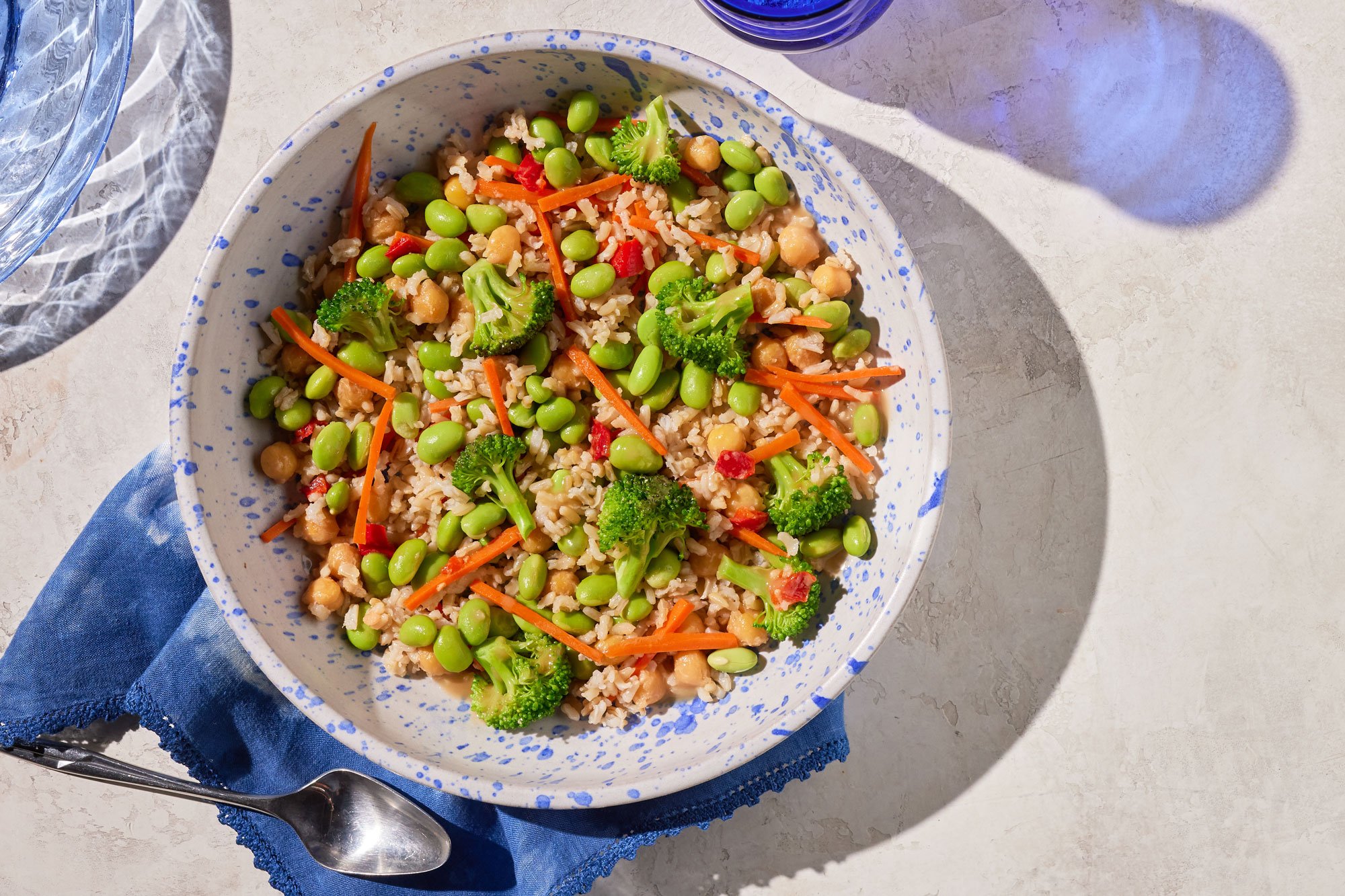
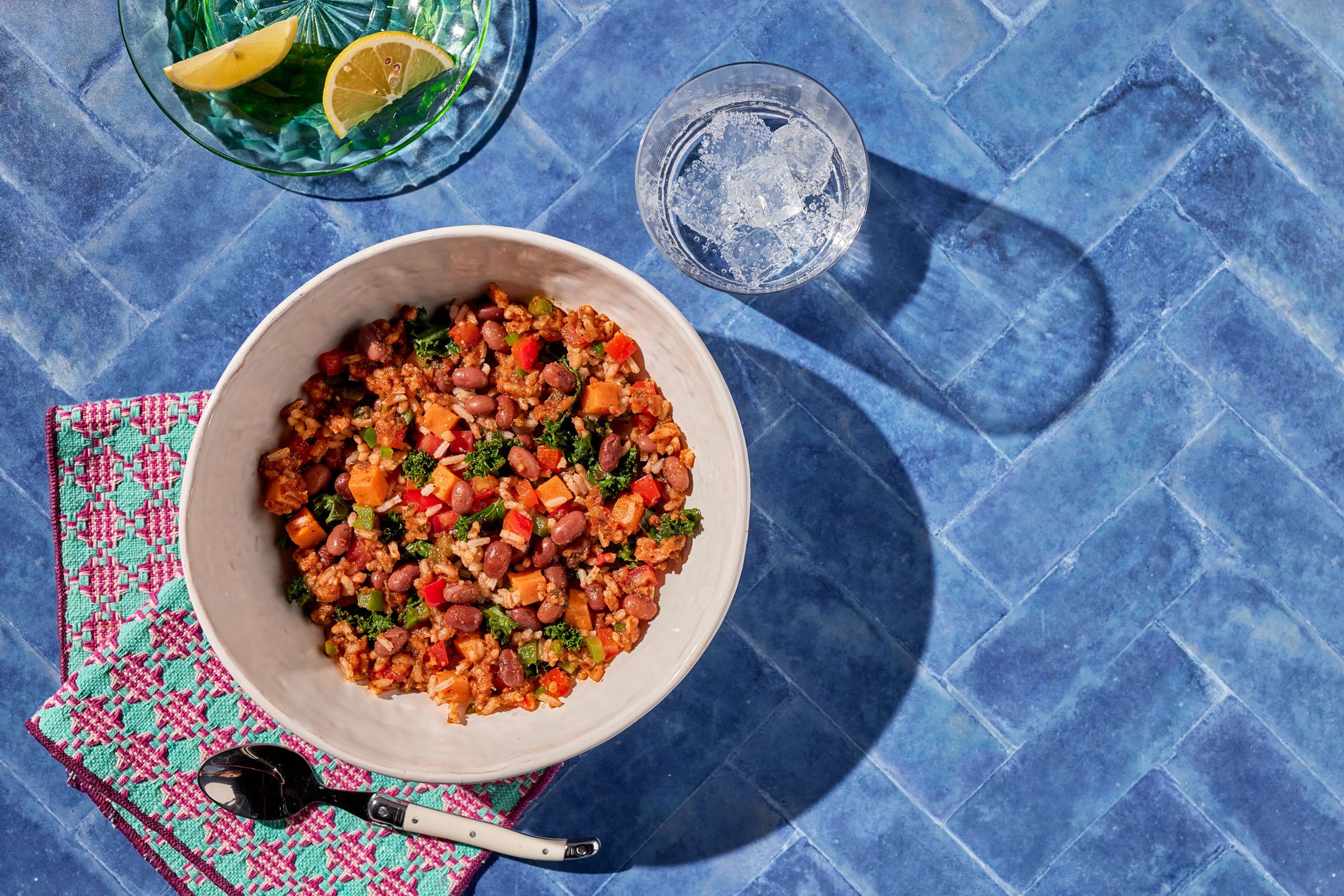
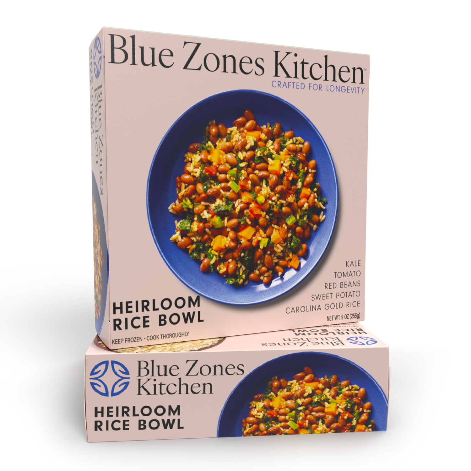
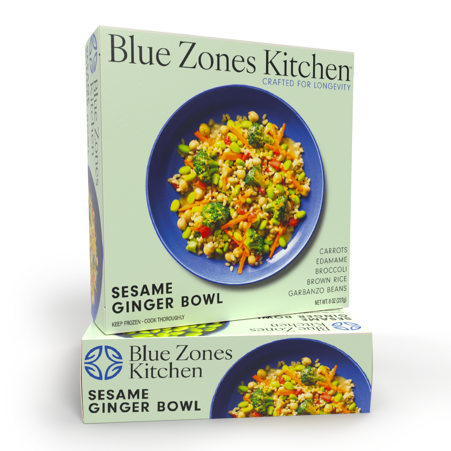
Enter Blue Zones Kitchen. Their delectable range of meals takes cues from the very principles Buettner discovered. Think beans, grains, vibrant veggies, and aromatic spices that echo the diets of the world’s oldest populations. The challenge? Creating packaging that matched the brand’s commitment to quality, flavor, and longevity.
Our Goals:
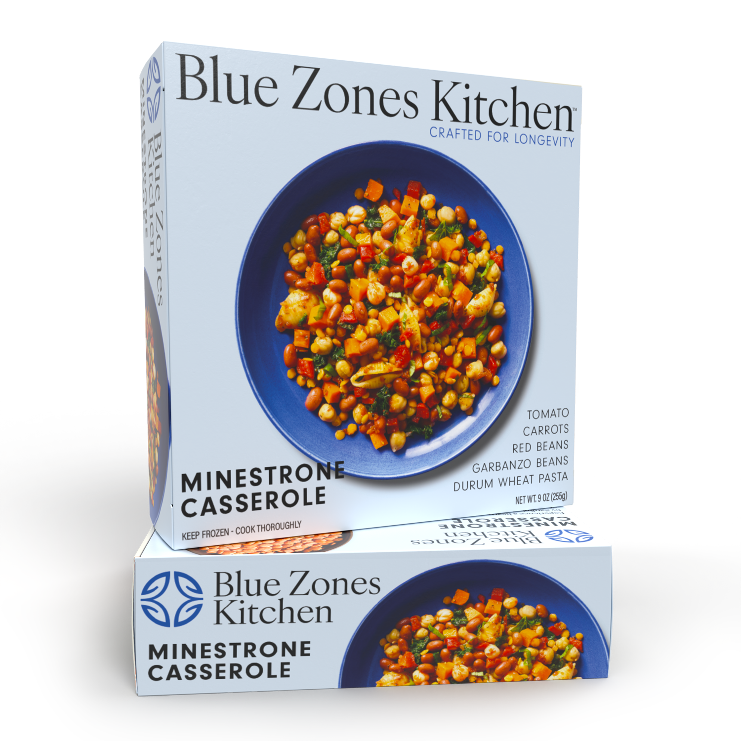
We aimed high: to produce a packaging design that could stand its ground amidst the sea of frozen meals, and more importantly, behind the frosty freezer doors. This wasn’t just about looking good; it was about feeling premium, high-end, and specialty. An added layer? The necessity to celebrate the ingredients of each meal through overhead food photography, resulting in a visual feast that had potential buyers' stomachs rumbling in aisles.
The Approach:
Our journey was no solo expedition. Multiple design studios collaborated in a creative sprint. The result? An amalgamation of the best elements from each design, converging into one compelling packaging layout.
Aesthetics and Design:
Taking cues from the category norm, we showcased the meals with an overhead view—a bird’s-eye perspective that detailed every ingredient. With an editorial-inspired design, we paired clean typography with pastel hues. The aim? Making the vibrant colors of the meals pop, while also allowing customers to make quick decisions in the fast-paced freezer aisle.
Collaboration:
Every great dish benefits from a little back and forth, a tweak here, and a pinch there. The Blue Zones Kitchen team were our sous chefs in this process, offering invaluable insights and refining our design journey.

Services:
Branding
Packaging Design
Production
Website Design & Development