Oats in Coats
We helped this fun kid-centric brand lean into their quirky character driven imagery and create energy on shelf.
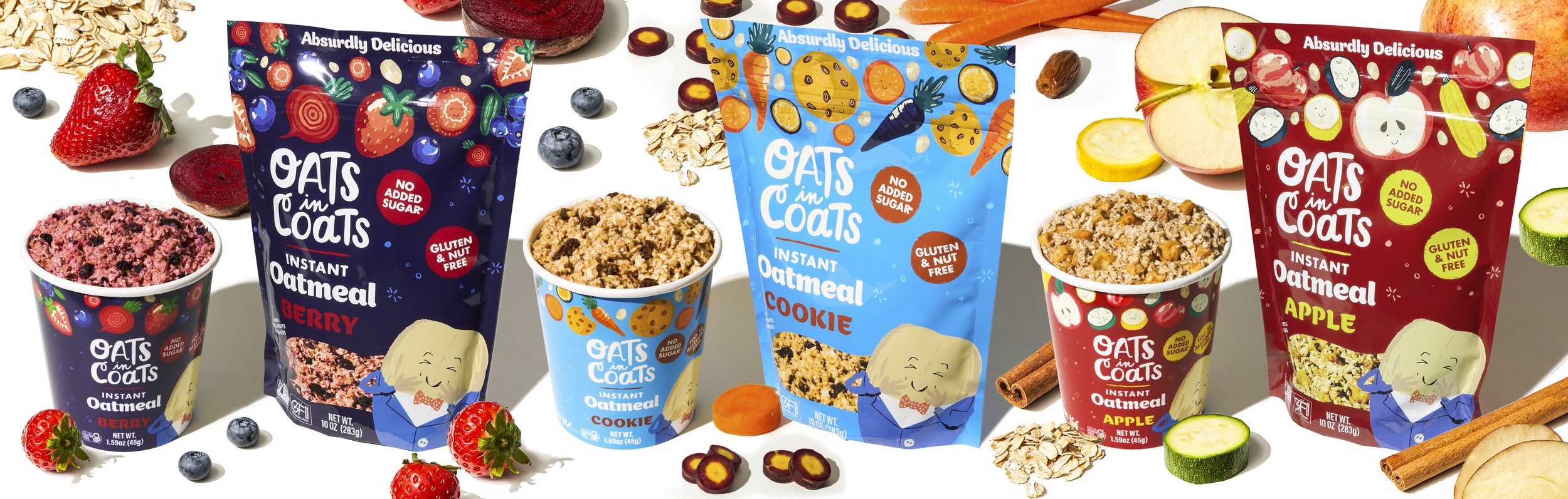
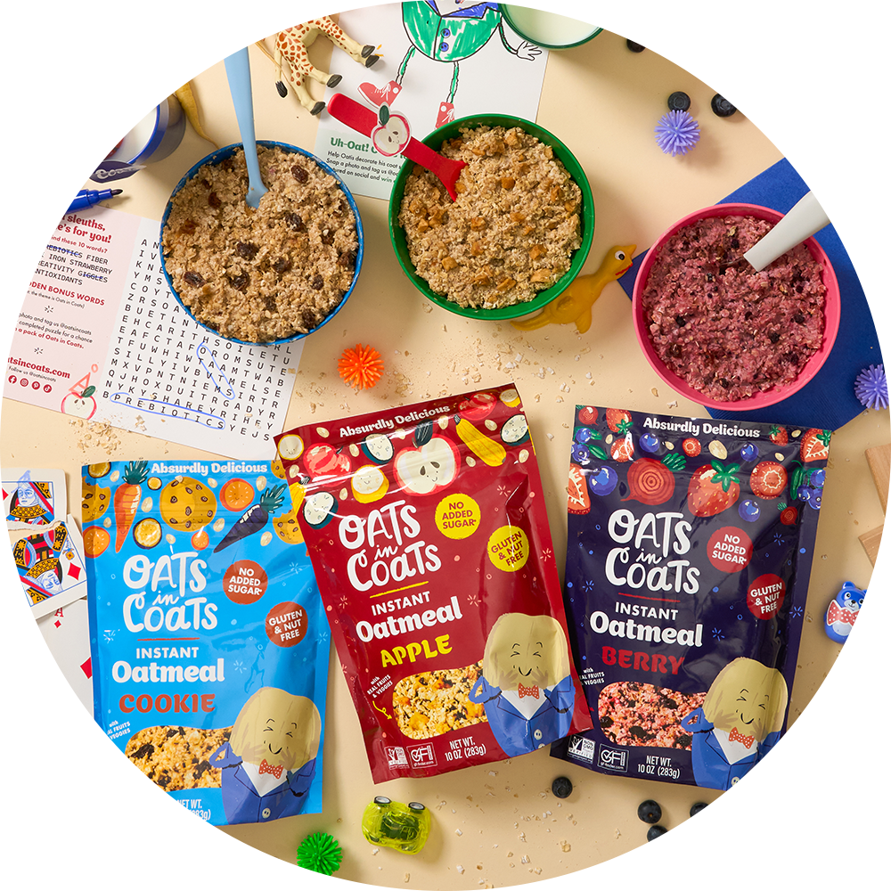
Every once in a while, a product comes along that isn't just about what's inside the package, but the whole story behind it. Enter Oats in Coats. Founded by a mom striving to make breakfast both tasty and whimsical, this brand brings the fun of imagining oats donning chic coats, fruits suiting up, and the unforgettable Oatis – the most stylish oat of them all!
Our task at Buttermilk Creative? Freshen up the packaging without losing the brand's heart and soul.

Design Goals and The Tightrope Walk:
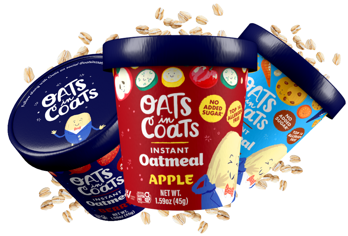
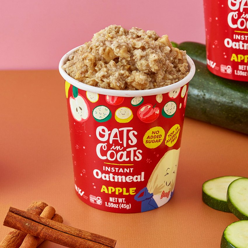
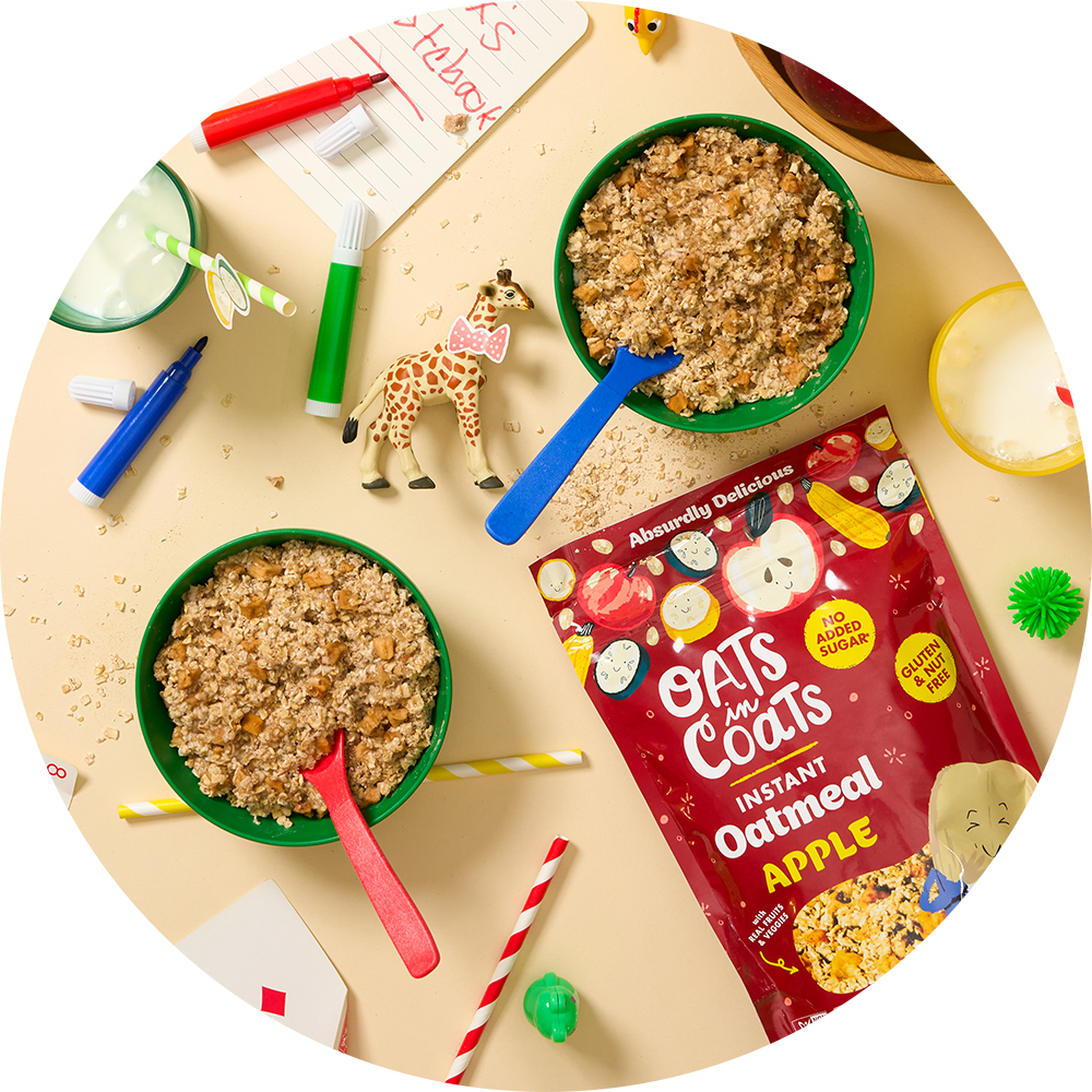
Oats in Coats had some solid fans. Like, super fans. So, when we got to the drawing board, we knew a total 180 wasn’t the play. Our challenge was to retain the brand's quirky essence, its colors, fonts, and lively illustrations, but give it some added pizzazz and clarity. Especially since they were adding a new flavor and shifting from paper cups to stand-up pouch bags. Talk about a design workout!
Old Friends and New Layouts:
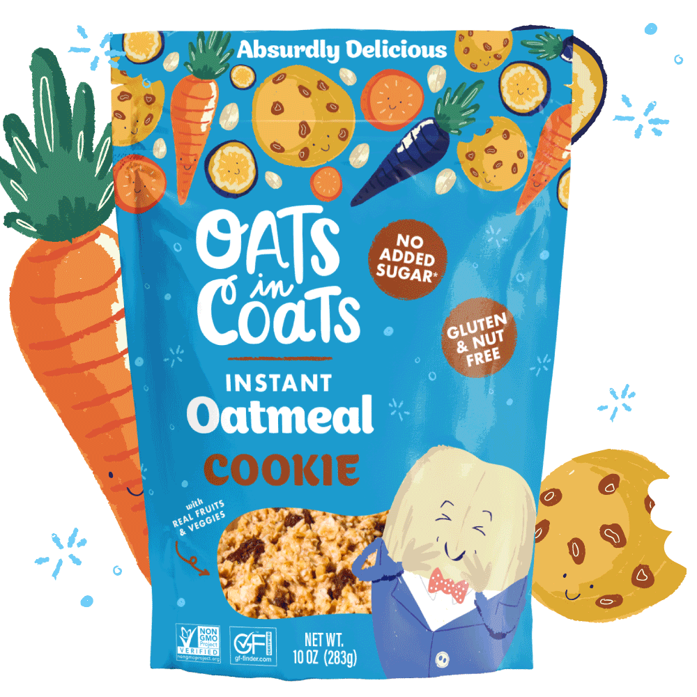
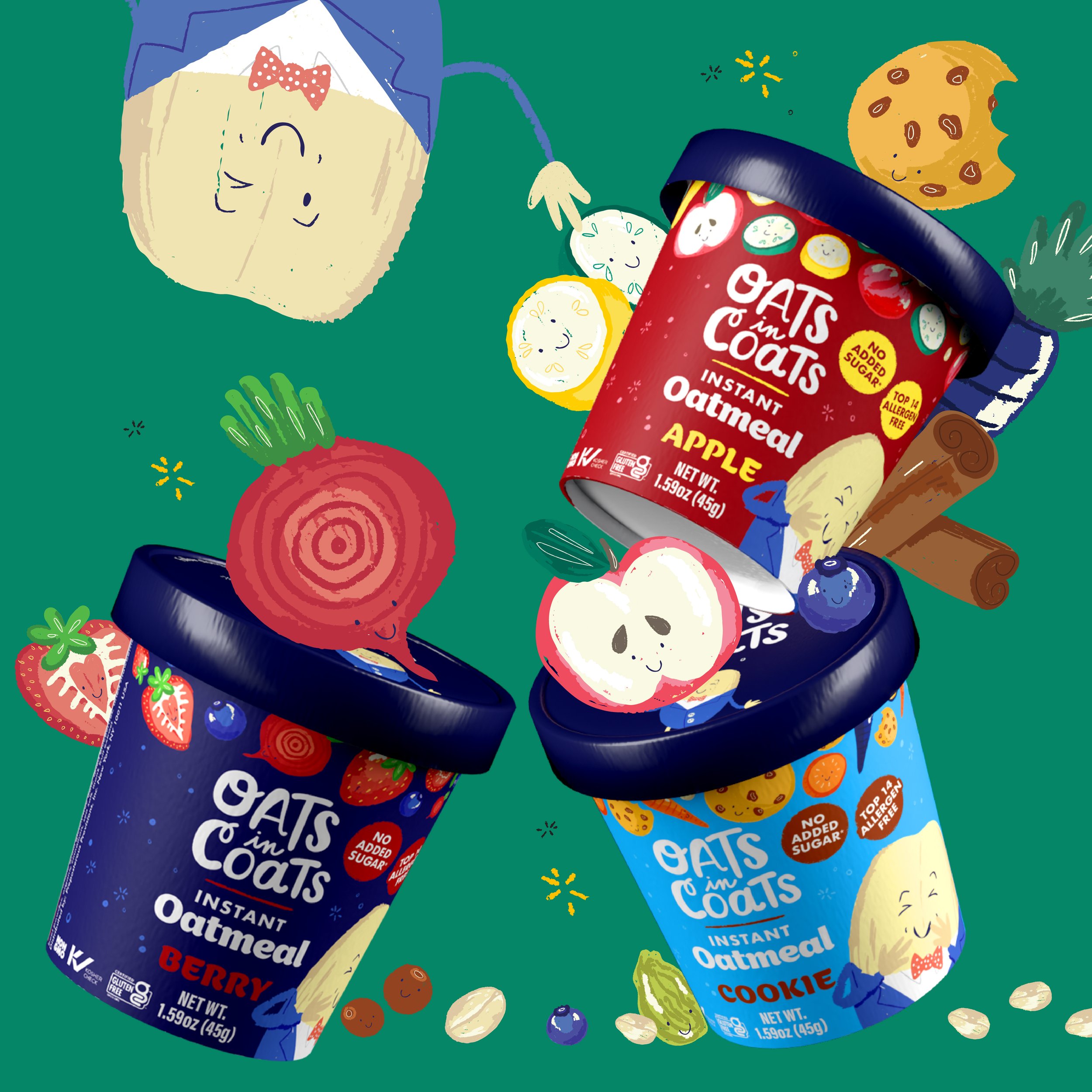
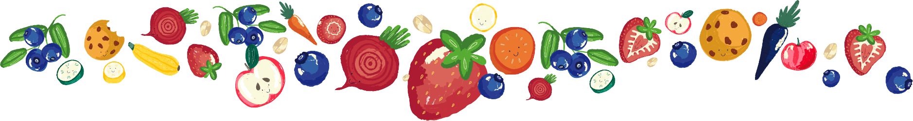
Drawing heavy inspiration from existing brand artwork, especially those delightful ingredient illustrations, we began our redesign journey. We also wanted Oatis, the iconic oat in a coat, front and center. (Because, honestly, who can resist that face?)
Design Tweaks and Triumphs:
We played around with layout, bumped up the font sizes for clarity, and introduced the "ingredient banner." Yep, that cool strip at the top showing off the yummy fruits and veggies in every bite. It was such a hit; it's now a brand signature, not just on packs but on their website and ads too!
Services:
Branding
Packaging Design
Production
Website Design & Development